Introduction to Layout Design
Layout Design Basics
Chapter Overview
Layout design is the process of arranging visual elements—such as text, images, and graphics—on a page or screen to create a cohesive and visually appealing composition. The goal of layout design is to guide the viewer’s eye through the content logically and engagingly, ensuring that the information is easy to navigate and understand. Whether you’re designing a website, magazine, poster, or brochure, understanding the basics of layout design is essential for creating effective and aesthetically pleasing work.
Introduction to Layout Design
In the world of design, layout is more than just arranging elements on a page—it’s about storytelling, visual flow, and usability. A well-structured layout guides the viewer’s eye, ensures clarity, and enhances engagement. Whether you’re designing a website, magazine, advertisement, or app, an effective layout can make the difference between confusion and clarity, frustration and ease, disengagement and action.
Great layout design isn’t just about aesthetics; it’s rooted in psychology and user behavior. By understanding how people perceive and interact with visual content, designers can create compositions that feel intuitive, balanced, and compelling.
In this chapter, we’ll break down the fundamental principles of layout design, explore different types of layouts, and provide practical tips to help you create visually appealing and user-friendly compositions. Whether you’re a beginner or a seasoned designer, mastering these principles will equip you to craft layouts that are not just beautiful but also functional and effective.
Let’s dive in!
Key Principles of Layout Design
1. Balance
Definition: Balance refers to the distribution of visual weight across a layout. It ensures that no single part of the design overpowers the rest and that the elements are harmoniously arranged.
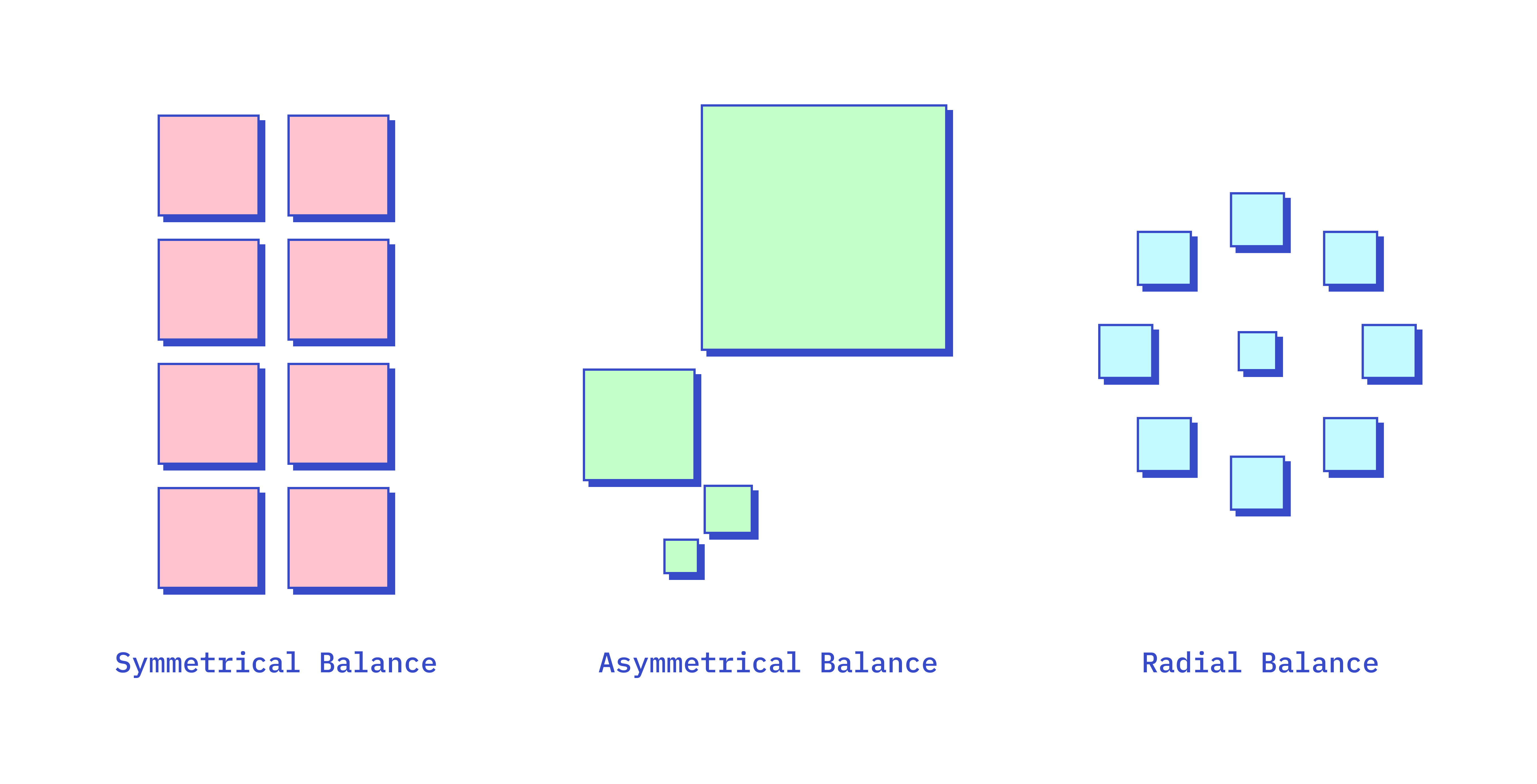
Types:
- Symmetrical Balance: Elements are evenly distributed around a central axis, creating a mirror-image effect. This approach conveys stability and formality.
- Asymmetrical Balance: Elements of different sizes and weights are arranged in a way that creates balance without symmetry. This approach is more dynamic and interesting.
- Radial Balance: Elements are arranged around a central point, radiating outward. This creates a circular flow and draws attention to the center.
2. Alignment
Definition: Alignment refers to the arrangement of elements along a common line or edge. Proper alignment creates order, organization, and a clean, professional appearance.

Types:
- Left Alignment: Text and elements are aligned to the left, commonly used for body text in Western design.
- Center Alignment: Elements are centered along a vertical axis, often used for titles, headings, or symmetrical designs.
- Right Alignment: Text and elements are aligned to the right, which can create a modern or unconventional look.
- Justified Alignment: Text is aligned along both the left and right margins, creating a clean, block-like appearance often used in print media.
Types of Layouts
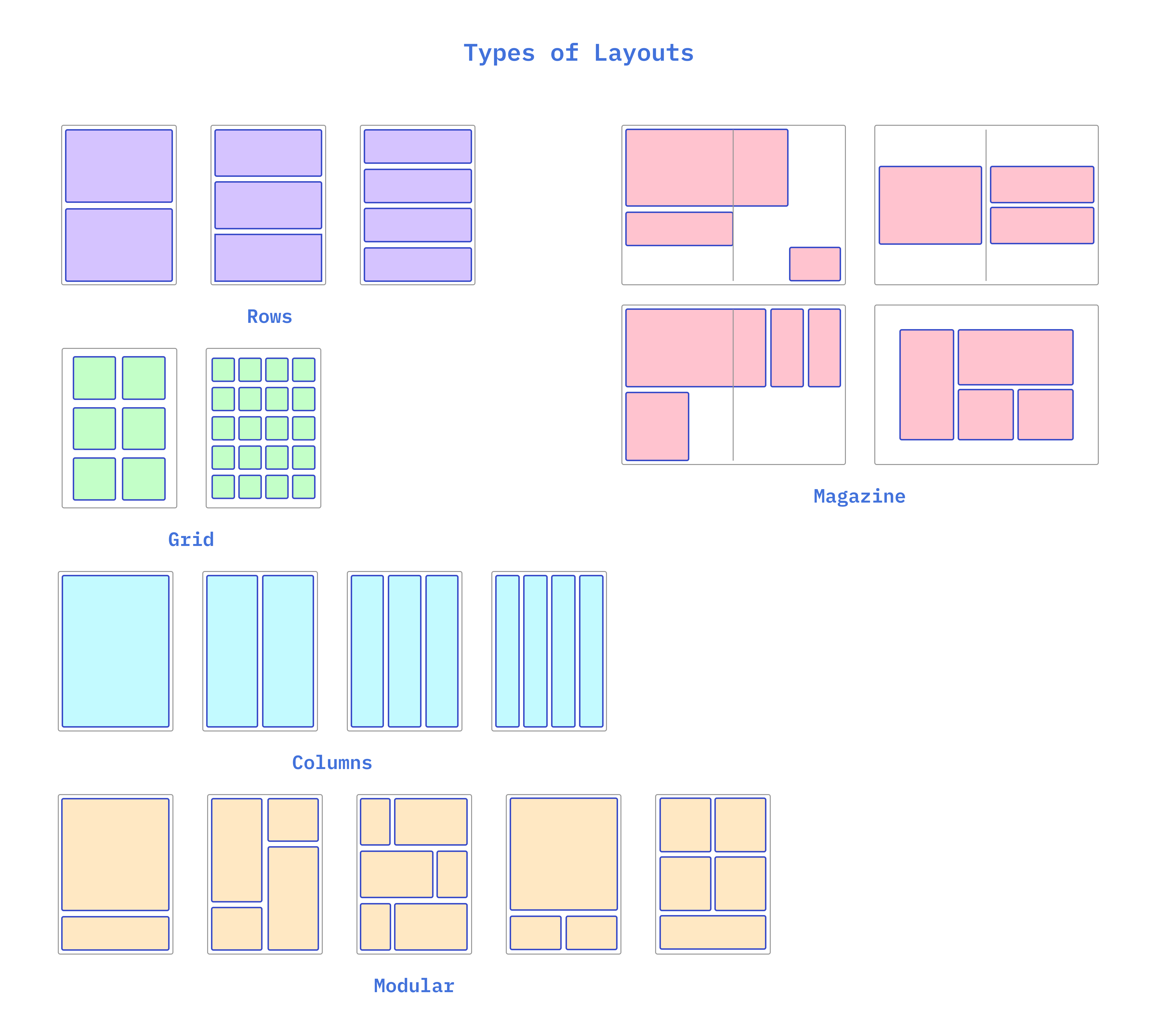
1. Grid Layout
Definition: A grid layout is a structure made up of intersecting horizontal and vertical lines that divide the page into columns and rows. This grid serves as a guide for placing elements consistently and proportionately.
Use: Grids are widely used in web design, print media, and graphic design to create well-organized and balanced compositions.
2. Single-Column Layout
Definition: A single-column layout presents all content in a single, vertical column. This is a straightforward, easy-to-navigate layout.
Use: Often used in mobile design or for minimalistic web designs where simplicity and readability are key.
3. Multi-Column Layout
Definition: A multi-column layout divides content into multiple columns. This is common in newspapers, magazines, and websites with a lot of content.
Use: Multi-column layouts are ideal for complex documents where different types of information need to be presented simultaneously, such as articles, sidebars, and images.
4. Modular Layout
Definition: A modular layout uses a grid of equally sized modules or blocks. Each module contains a distinct piece of content, such as text, images, or links.
Use: This layout is often used in web design, portfolios, and product catalogs, where a modular structure provides flexibility and consistency.
5. Magazine Layout
Definition: Magazine layouts often use a combination of text and images in a creative and dynamic way, often breaking traditional grid structures.
Use: Ideal for editorial content, advertisements, and any project that requires a more artistic or narrative-driven approach.
Practical Tips for Effective Layout Design
1. Start with a Grid
Even if your final design doesn’t stick strictly to a grid, starting with one can help you maintain alignment and balance in the early stages of your design.
2. Prioritize Readability
Ensure that text is legible by choosing appropriate font sizes, maintaining good contrast between text and background, and using sufficient line spacing.
3. Emphasize Key Elements
Use hierarchy, contrast, and alignment to highlight the most important parts of your design, such as headlines, calls to action, or key visuals.
4. Balance Visual Weight
Distribute elements evenly across the layout to avoid any section feeling too heavy or too empty. Symmetry can help with this, but asymmetry can also be effective if carefully balanced.
5. Use White Space Wisely
Don’t be afraid to leave areas of your design blank. White space can significantly enhance the clarity and focus of your layout.
6. Test and Iterate
Review your layout on different devices and in different formats to ensure it works well in all contexts. Be prepared to adjust spacing, alignment, and other elements as needed.
Conclusion
Layout design is a critical component of any visual communication project, guiding the viewer’s eye and organizing content in a way that is both functional and aesthetically pleasing. By mastering the principles of balance, alignment, proximity, repetition, contrast, hierarchy, and white space, you can create layouts that are not only visually appealing but also effective in delivering your message.
Whether you’re working on print media, web design, or any other form of visual communication, a strong understanding of layout design basics will enable you to create engaging and effective compositions.
Leave a Reply